The Production Possibility Curve
- S K Singh

- Jan 31, 2020
- 5 min read
A picture is worth a thousand words. Unfortunately for you, this does not equate to you being allowed to draw a bunch of pictures on your economics essay and expect an A. However, it is not uncommon for people to draw on their economics essays. Before you burst out your pack of HB pencils and Faber-Castell water colours, I am not referring to you drawing pictures like you’re the next Michelangelo because chances are you don’t have the skill and secondly, the drawings used in economics are graphs.
I mentioned in my previous post that I will explain how to use a singular graph to illustrate the core economic concepts so this exercise will be exciting for those who can’t be bothered to read their lecture notes or those who just like shapes.
The Production Possibility Curve(PPC) is the clairvoyant that will rid you of any confusion you may have had in my previous post. It also happens to be the topic of the post if you haven’t guessed that already.
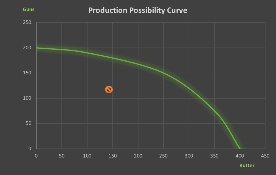
Basically, the PPC is a curve that essentially shows that if you want more guns you must have less butter and vice versa. The PPC is a curve showing all possible combinations of 2 goods that a country can produce within a specified time frame with all of its resources fully and efficiently employed at a given state of technology.
Yes yes, I get it. The proper definition is a mouthful and you didn’t understand what it meant. Here, I’ll break it down. Basically the PPC assumes that a country is only producing two goods. Either Guns or Butter (not necessarily the only thing, you can use Good A and Good B to illustrate the axis as well). If a country uses all its resources(recall last post) to produce goods, these limited resources can only produce a certain amount of combinations of goods. Either you have 200 guns and no sticks of butter or you have no guns and 400 sticks of butter. And every combination in between on the curve, 150 guns & 250 butter or 190 guns &100 butter etc etc. But why the need to specify given state of technology and specified time frame? That’s because if these variables change, the amount of resources you have can increase/decrease which means you need a whole new PPC curve and I have to then spend another 20 minutes on Excel figuring out how the hell do I plot the damn curve.
I’ve illustrated the curve below.

But how does the curve show Scarcity, Opportunity Cost and Choice?
Let’s tackle choice first. Remember in the previous paragraph where I spoke about different amounts of guns and butter? That’s choice. When a country chooses to go full 2nd Amendment and have 200 guns and no butter, it is making a choice. It’s also making a choice when it chooses to have 150 guns and 250 butter.
But what about Scarcity? Scarcity is illustrated by points outside the curve. Remember, scarcity is about wanting something more than you already have. The smiley face on the graph illustrates that. The country is only able to produce so many goods at the current moment but it wants more: Scarcity. For example, a point outside the curve would be the Pink IC that all NSFs want to get, but let’s say they get to that point, then the point would just move outwards as now the ORD personnel want something more, like a stable job etc.
And how exactly does the curve portray Opportunity Cost? The negative slope of the curve does that.
If you want more guns, you’re going to have to give up some butter and vice versa. The opportunity cost of having 200 guns is 400 sticks of butter etc.
Interestingly, the curve also illustrates something else: The Law of Increasing Opportunity Cost. This is shown by the concave shape. As you use your resources to make more guns, you have to increasingly give up more butter. And if you use your resources to make more butter, you have to give up more and more guns.
But what about that ‘stop symbol’ inside the graph? Think of that as an undesirable area for an economy to be in. If the economy was operating fully efficiently and all its resources were fully employed, then the economy would be operating somewhere on the curve itself depending on the output chosen. But if its operating at the ‘stop symbol’, its resources are not fully employed and the economy is not operating at full efficiency.
Theoretically its always best to operate on the curve itself but realistically you’ll always have some joker slacking off on his job or taking countless amounts of MCs to skip work. Realistically, a country can never operate at on the curve itself unless by some dystopian-science-fiction-novel-esque way, the country is able to make every resource perform at their highest standards.
Now my excel skills are completely shit so bear with me and just imagine that the 2 curves below are nice and smooth like my first graph.

Okay so I hope that your eyes are working and can see that there are 2 different arrows of different colours in opposite directions.
The blue curve (new one) represents a new PPC that the economy would like to reach (hungry for more -> human trait -> scarcity) . But how do you reach such higher values?
Well remember the definition of the PPC and the variables in it? Given state of technology? Fixed time period? Well with those 2 in mind, over time a country can receive improvements to technology which can increase the quantity of resources a country has, the quality of its resources as well as hire more labour (foreign workers etc). This will allow the country to have an outward shift of its PPC. An outward shift of the PPC is due to 1) Improvements in the state of technology 2) Increased Quality of Factors of Production 3) Increased Quantity of Factors of Production.
Just give it a minute and it’ll sink in. It really isn’t that hard.
So the Yellow Arrow showing movement from green curve to becoming blue curve illustrates an outward shift of the PPC. But what about the Blue Arrow?
Is that an inward shift of the PPC?
Goddamn right it is, just because you can become better doesn’t mean you’ll always stay there. Look at Ancient Greece or Rome, great examples. Under certain conditions which causes the quality and/or quantity of inputs to fall, an economy’s PPC can shift inwards. It’s causes are basically the opposite of an outward shift. An inward shift of the PPC is due to 1) Fallen Quality of Factors of Production 2) Fallen Quantity of Factors of Production.
We don’t really use fallen state in technology because you know, interconnectedness of things, technological state is quite hard to decrease etc etc you’ll probably learn more in a geography or social studies textbook.
See ya next post.
Insightful read on economics essays! Mastering economic concepts for essays can be challenging, and having reliable assistance is crucial. If you're seeking extra support, I highly recommend exploring MyAssignmentServices for exceptional Economics Essay Help. Their expert guidance has been a game-changer for many.